Dorothy Goode
Selected Press
Friderike Heuer, Oregon Artswatch, January 2020
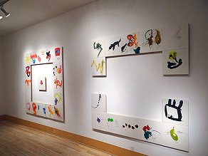
“What drew me in was the exuberance in these paintings and the sense of something moving, of speed... in equal parts giddy and compulsively driven, a perfect tension between lifting your soul up and weighing your heart down with the emotional valence behind those expressions... Overall it is the expansiveness of the gesture that is the catalyst for the psychological impact... Things merging and overlapping have blossomed into full form in Goode’s abstractions. She also frequently experiments with flat fields of colors and strong contours... It struck me as joyful, in the Nabi tradition: playful beauty, geometric lightness in 3D.”
Link to original article with images:
https://www.orartswatch.org/nothing-at-all-of-this-is-fixed/
Visual Art Source, December 2019
“In a unique and anachronistic fashion, Goode paints with egg tempera, a medium usually associated with Byzantine and Renaissance art, to create ebullient gestural paintings in the lineage of Abstract Expressionism and Lyrical Abstraction. Tempera imparts a startling translucence to her vibrantly hued brushstrokes and excavated surfaces, allowing viewers to peer through many layers of materials and process. Elegant and assured, the paintings convey buoyancy, kineticism, and complexity, encapsulating a lifetime of journeys and aesthetic inquiry.”
Art Business, April 3, 2014
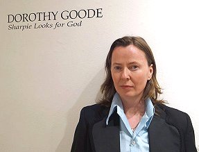
Review of Sharpie Looks for God at Toomey-Tourell Fine Art (San Francisco, CA)
by Kathryn Arnold“...In Dorothy Goode’s Sharpie Looks for God (Toomey-Tourell, San Francisco), joyous, conjoined splashes of color are occasionally embellished with snippets of text. A sense of spontaneity informs the informal compositions. A few harken reminders of Sam Francis, yet Goode’s color-blended-with-text art displays a sense of play...”
Link to original blog post with images:
http://www.artbusiness.com/1open/040314a.html
ARTSYforager, May 16, 2013
"Painting Confidences: Dorothy Goode"
by blogger Lesley Frenz“I’ve been told I’m a good listener. So people tend to tell me things. Secret stuff that maybe no one else knows. We all have that friend, the one everyone confides in and is completely confident their secrets will be taken to the grave. In her Other People’s Secrets series, Portland artist Dorothy Goode has found a way to get those piled-up secrets out, without ever truly spilling a single one. The artist began each panel by dipping her fingers into sumi ink, then sprawling secrets over the surface of each panel, first her own and then the confidences of others came leaking out. The letters and forms are mostly illegible, making sure that each secret is still safely hidden. Once the secrets are spilled, the artist then covers them with colorful, scrawling abstract gestures in paint. In that final step, I see an analogy to the way we live with our own well-kept mysteries; we hide them in plain sight, often burying them just beneath the brightly colored surface.”
Link to original blog post with images:
http://artsyforager.com/2013/05/16/dorothy-goode/
Oregon Home, November 12, 2012
"Without Borders" by Brian Libby
...Down the hall from a rustic French farmhouse table and petrified-wood stools from Java is a statue of the Chinese goddess of compassion, Quan-Yin. Upstairs are artworks not only by the likes of Matisse and Picasso, but also acclaimed local artists such as Michael Hensley and Dorothy Goode...Link to complete article:
http://oregonhomemagazine.com/homes/1083-without-borders-interchange
Meg Biram: The Edit
Lifestyle Blog featured in The Washington Post
February 27, 2012
"Art to Fashion: Heidi Merrick + Dorothy Goode"
Link to original webpage:
http://www.megbiram.com/art-to-fashion-heidi-merrick-dorothy-goode/#
Visual Art Source, May 15, 2010
"Recommendation: Dorothy Goode"In Paintings I wrote on in 2009, Dorothy Goode introduces a new element to her visual vocabulary: graphite scrawls that spell out formal messages both cryptic and self-revelatory. The texts are for the most part obscured behind layers of impasto, lending the works an electric tension between expression and concealment. As she has in previous bodies of work, Goode favors a palette of bold reds, blues, oranges, and greens, which pop against the panels' white grounds. Her curvilinear gestures, vaguely biomorphic, cluster in the center of each composition, as if tugged by centripetal force.
More hyperkinetic and dense than the work in her previous 2008 outing, Homage to the Graffiti I Didn't See in NY, the painter now cedes Zen-like elegance to maximalist furor. Whereas the surfaces in Homage... whispered with the translucence of egg tempera, the current surfaces are more painterly and exhibit a greater variety of application, at times recalling the squeegee-happy marbling of Gerhard Richter's paintings in the vein of Abstract Expressionism. Happily buoyant, Goode's panels escape the gravity of their historical antecedents, thanks in large part to the graphite doodles undergirding her arcing gestures. This mark-making lends a confessional, Gen-Y quality that feels thoroughly contemporary to the age of blogs and Facebook. The artist channels the Zeitgeist's uneasy duet between insularity and extroversion.
Burnaway, April 27, 2009
"Emily Amy Gallery: Paint as Subject"The new show at the Emily Amy Gallery, “Paint as Subject,” features a delightful selection of paintings whose focus is paint itself. Dorothy Goode, James Leonard, Melanie Parke, and Carl Plansky are all talented artists reviving the modernist aesthetic and theory that a painting should remain true to itself.
As you enter the gallery space, you immediately encounter Dorothy Goode’s work, consisting of splashy, bold colors with lots of white space, black lines, and scratching into the egg tempera paint such as in Big Squares 12. There are many layers of paint on each panel, but overall the surface remains flat. In this painting and others, there are still some figurative elements, as if a person has been suspended in time before the viewer’s eyes. Goode’s use of bold colors against a predominantly white background and the texture created by the layers of paint make her work some of the most visually interesting of the exhibition...
OregonLive.com, February 17, 2006
"Smashing Flow" by TJ NorrisIf Abstract Expressionism had been born yesterday, Dorothy Goode may have been the doyenne of it all. Butters presents two new series of her works called Medium matters: Echo and Circular Saw. In the Echo series, the smaller of the two groupings, she recreates the relationship of an old-fashioned technique of egg tempera on panel. In these 16”X11” beauties, her white-washed variations of color and deliberately improvised mark-making reminisce with modern-day graffiti and its removal within the same context. The works are little capsules, or windows, into urbanity. Feathery lines and double layers of hidden meanings or secret languages. Though there is no actual text, her corrugated approach to stylizing or redefining shapes through obliterating parts of them is as romantic as it is cryptic. Some are simplistically immediate (Echo Series 8), while others are a bit of an acid wash rapture of off-beat color (Echo Series 13). What works mostly about this series is that they can be viewed micro/macro and still offer an impression; they are like contained, blown-up details of a de Kooning (formalist, not feminist perspective). In this same breadth, this is what remains puzzling about the work, the quality of editing something that would ordinarily be uncontainable.
Her other Circular Saw series here, all from 2006, are extensions of the smaller pieces, less “framed” at 48”X 16” – but also more minimal somehow – incorporating mixed-media sculptural elements and attempting to reveal the naked and partially deconstructed panel surfaces. These pieces, though spiritedly physical on the whole, seemed less realized to me, though the elongation and gestural immediacy do have a tribal-like quality. Color seems to be to a lesser extent the focal point as layers of whites coat the surface of color, creating various neutrals. This approach dictates a haze of meaning, a cover-up, bloody secrets in the snow (Circular Saw Series 7). Open shapes are hinted at when revealed and concealed, but Goode prefers the double-take in order to discover something hidden in the light of looking: something about the act of the momentary gaze, just under the surface.
The Oregonian, Arts & Entertainment, February 10, 2006
"Medium Matters"Dorothy Goode’s skill as a painter is well-evidenced at Butter Gallery this month in a show of recent works – very recent, in fact; most of the paintings on display were completed in 2006 – called Medium Matters.
The words on exhibit include Goode’s visceral, elongated Circular Saw series and the larger Drawing on Unstable Ground #11 and #12. In the latter, the artist’s compositions are created from austere crusts of plaster, at times so heavily worked that the wood panel beneath shows through in chipped and shredded swatches or the darkly secretive maw of a puncture.
Then there is the more delicate Echo series, done in egg tempera on wood panels. These vary from the stark, elegant gesture of black and gold that is Echo Series #11 to the more densely layered membranes of almost edible lemon and grass-green hues in Echo Series #19. They’re marvelously energetic, but it’s a suggestively diffuse energy, as though the vigorous musicality of a Kandinsky had been submerged in water until its hard edges dissolved. Kandinsky himself said, “The more abstract is form, the more clear and direct its appeal,” and Goode does well by that advice.
Willamette Week, April 14, 2004
"April Round-up"Perhaps the most arresting works at Butters this month are in the back-room group show. Dorothy Goode's new paintings in the vein of Abstract Expressionism exult in bold strokes in pink, raspberry, and chartreuse. Who knew such soft colors could pack such a virile punch?